Making compliance work manageable
GapSolutions brought in ByteCraft as an outsourced design and development team for the platform Danish and Nordic municipalities use to run their GDPR, NIS2 and DORA obligations.
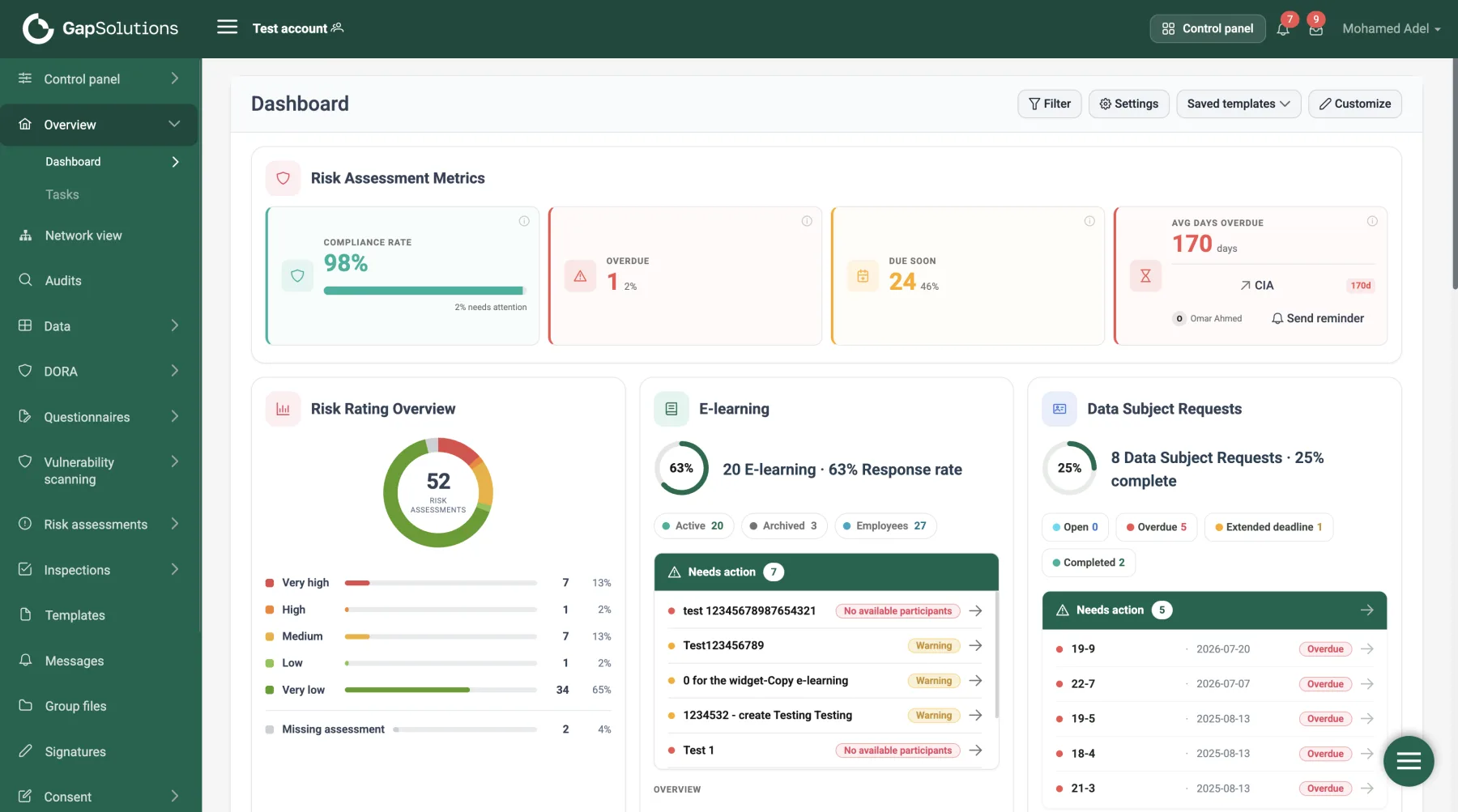
Compliance software for people who are not lawyers
GapSolutions is a white-label compliance portal. Municipalities, companies and their suppliers use it to keep track of their obligations under GDPR, NIS2 and DORA — work processes, data recipients, security measures, risk assessments, inspections, and the records that prove all of it. Every account can re-skin the product with its own brand colour, and the interface ships in five languages with Danish first. Our brief was straightforward and hard to satisfy: help people manage this work with the least effort the regulation allows.
A growing set of modules, not a single redesign
Since 2023 the engagement has grown from individual screens into full modules across the portal — designed and built end to end by our team.
- Work processes
- Data recipients
- IT systems & assets
- Security measures
- Risk assessments
- Inspections
- Audits
- Network view
- Questionnaires
- Templates
- Question bank
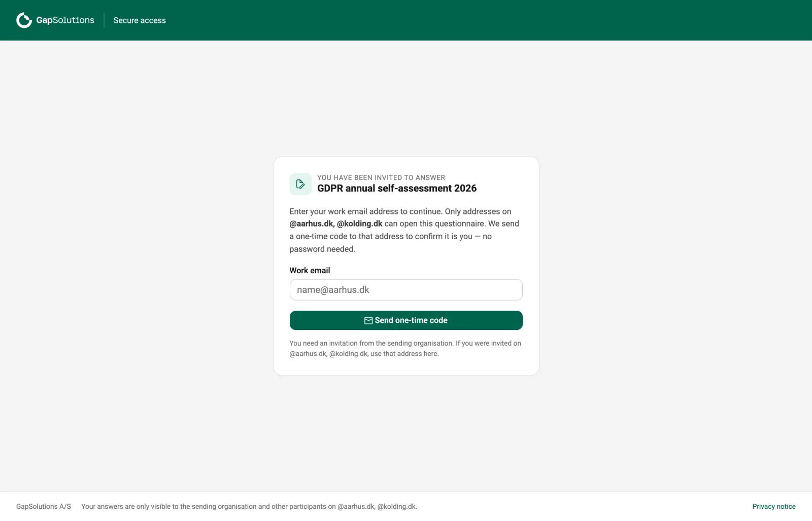
- Respondent portal
- Courses
- Sequences
- Reports
- Certificates
Four roles, one daily user
Four roles use the portal, and only one of them opens it every day. The other three arrive with a single task and no patience for the rest of the product.
Compliance administrator
Needs to see what is overdue across every module without opening each one to find out.
Department owner
Wants their own assigned work, not the whole organisation's compliance picture.
External respondent
Opens a link from an email, answers one questionnaire, and never returns.
Employee
Completes the training, passes the check, and gets back to their actual job.
Four problems, side by side
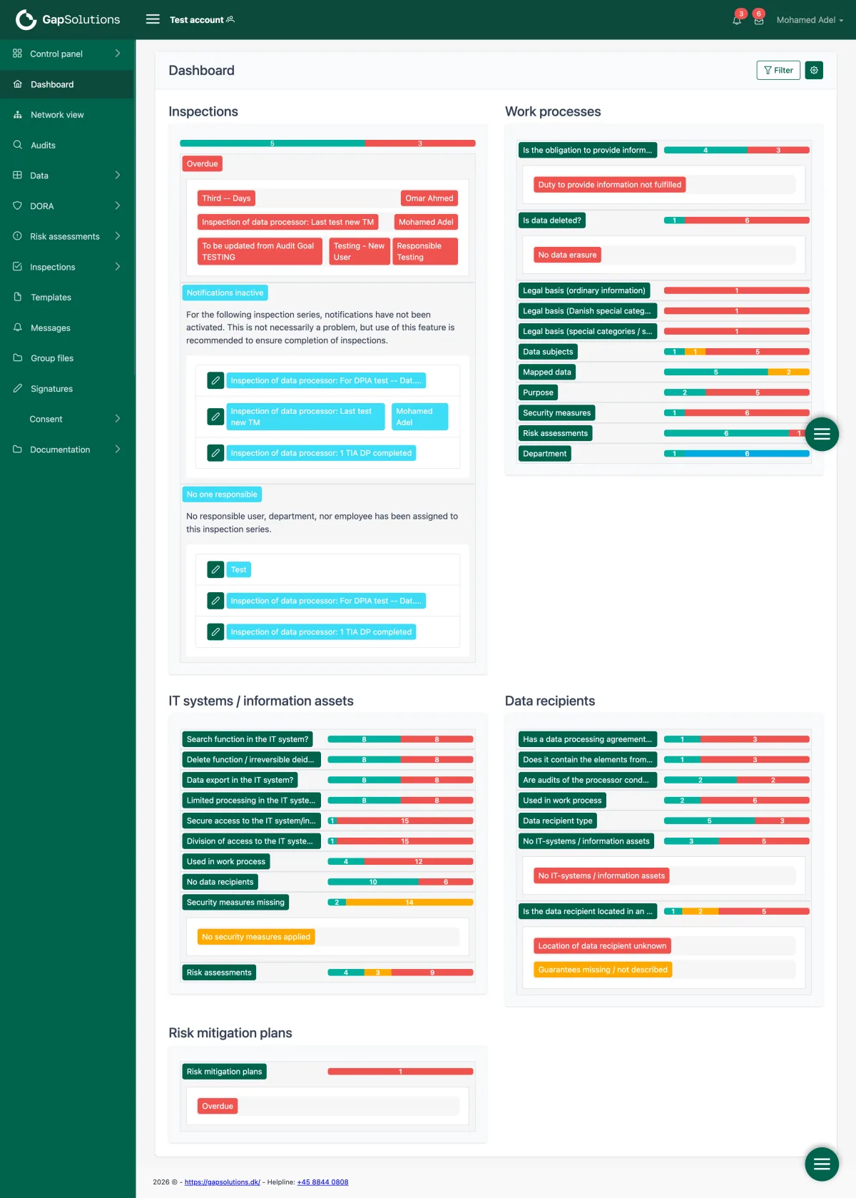
The dashboard reported; it never advised
Every module printed its full status as a coloured bar with a number on it. Nothing ranked anything, so where to start was left entirely to the user.
One card per domain, each naming its next action
Completion, distribution and items needing attention live together on the card that raised them. States are words — on track, due soon, overdue.
Each module invented its own list screen
Filtering, sorting, pagination and row actions were solved separately in every area. The same task looked different depending on where you were standing.
One filter bar and one table, everywhere
Search, filters, tabs, pagination and row actions are the same specified components across questionnaires, e-learning, reports and the control panel.
Collecting answers happened outside the portal
Self-assessments were sent as documents over email, chased manually, and re-typed on return.
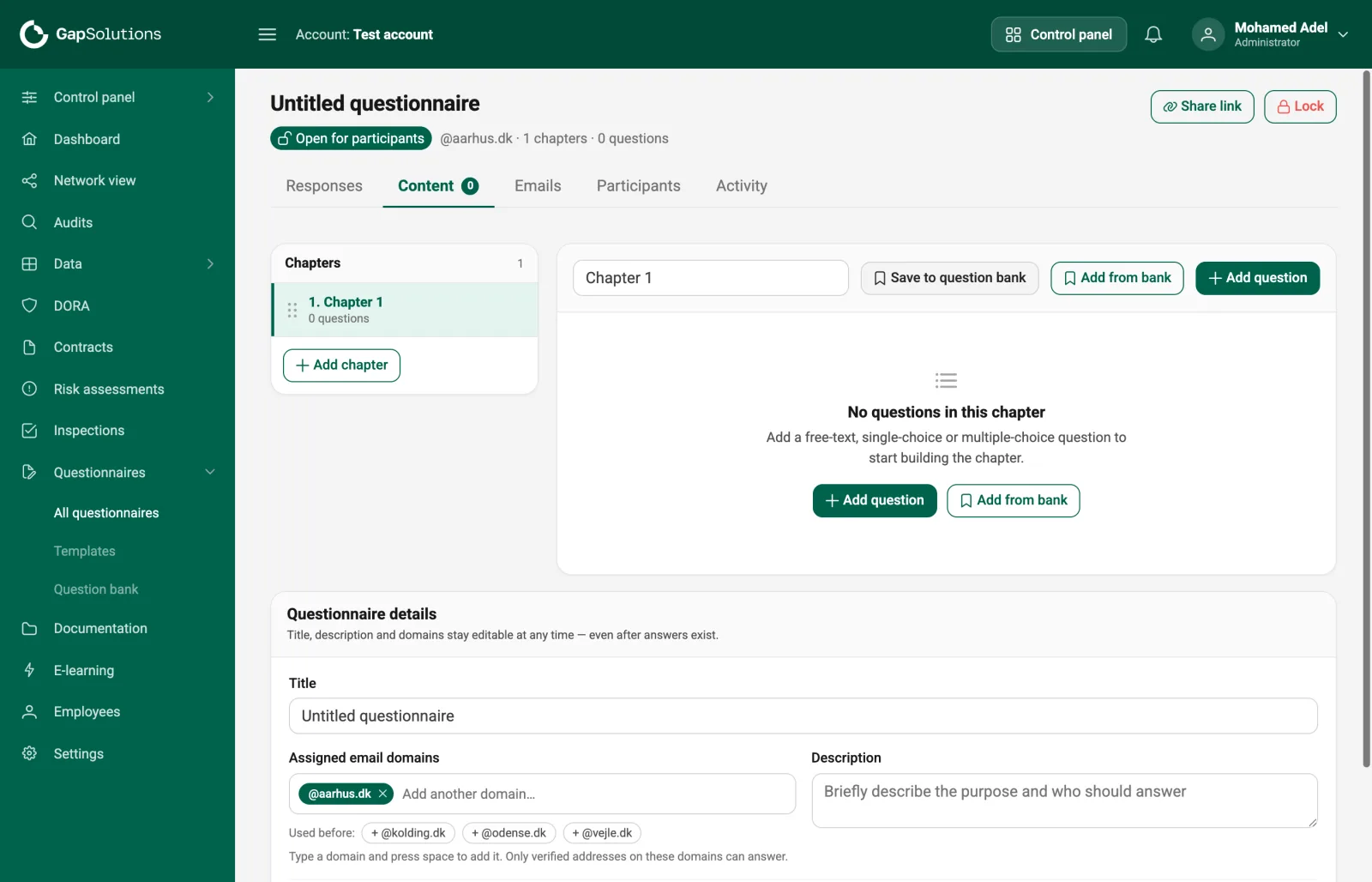
A questionnaire module with a respondent portal
Written once from a reusable question bank, shared as one verified link, answered in a portal built for someone who will never log in again.
Shared parts had no shared definition
The same card, badge and progress indicator existed in several slightly different versions, maintained by whoever touched that screen last.
29 primitives extracted from the product itself
Tokens and components taken out of the running codebase, so a redesigned screen reads as the same software — and a re-skin touches two colour tokens.
Dashboard, before and after
The screen every administrator opens first. It reported everything and told them nothing about where to start.
The questionnaire module
New work, not a redesign: GDPR and NIS2 self-assessments sent to municipal units and suppliers — written once, reused, and answered by people who have never seen the portal.
"Compliance work is already the hard part. The interface should not be a second thing to manage."
Extracted from the product itself
Rather than invented, so a redesigned screen reads as the same software — and our own backend team, working in Laravel and PHP alongside the Vue front end, ships it directly instead of handing off a spec.
How the work reaches engineering
One folder per screen: a written specification of every card, state, token and string; a standalone prototype running with no build step; source references mapping the prototype's components to the codebase's own Vue primitives; and a data model showing the shapes each screen expects. As the embedded product team, our own engineers carried this straight into the live Vue codebase rather than handing it to a separate crew.